episode 30: Windows 10 Fluent Design and the Future of Presentation Design
Summary
Microsoft has just started releasing its next update to the Windows Operating System, called “The Creators Update.” Looking at the available details, the new aesthetic styling system, labelled “The Fluent Design System” has some exciting ideas that will hopefully carry over into the presentation design world. It is called the “Microsoft” Fluent Design System, which implies it will not be limited to the Operating System, but the new styling and aesthetics will carry over into every app and feature.
Topic
- Timeline
- Last week, May 10-12, was the Microsoft Build Conference 2017. A large part was providing details, as well as the rollout start, for the Windows Creator Update.
- Last week, May 10-12, was the Microsoft Build Conference 2017. A large part was providing details, as well as the rollout start, for the Windows Creator Update.
- Windows 10 Creators Update
- The big take away for me (Troy), or at least the practical information, was the Windows 10 Creators Update was finally unveiled, and being rolled out.
- Within the Windows Creators update is a new overarching philosophy for the visualization of the interface and applications, the Fluent Design System.
- The Fluent Design System is made up of 5 aesthetic styling pillars. I hope that the implementation of these 5 aesthetics lead to some exciting options for us in the presentation space.
- The five pillars of The Fluent Design System are: Depth, Motion, Material, Light and Scale.
- Fluent Design #1: Depth
- The Windows 8 “Metro” design, which is a flat 2D icon based design, was referred to as “dull, flat, and full of boring frames” – not something I agree with being a negative.
- I think the simple explanation of Depth in the Fluent Design system is that it adds a Z-axis to the entire Windows Operating System.
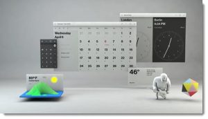
- The build conference demo showed a calendar app zooming in 3D style on an at-a-glance agenda item to make it the focus.
- There could be some great slide design, a way to move to less 2D and stacked elements layout.
- Fluent Design #2: Motion
- Presentation has to be one of the highest users of motion, outside something like the Xbox game group.
- From the demo, it looked like a quick Morph transition had been applied to apps as they changed content being displayed.
- Joe Belfiore, the Microsoft presenter, described the use of motion in Fluent Design as a movie director using movement to lead the viewer to the story they want to tell. Quote – “Motion design has a special power to bring all of our experiences to life and lead people from one task to another with a cinematic ease.”
- Sounds like presentation design to me!
- Fluent Design #3: Material
- The focus seems to be on leveraging the new 3D capabilities in every aspect of Windows. So things have texture, real world aesthetics, and standard shapes can be overlaid with different materials and characteristics.
- In the Creators update, one example is updating message and interface boxes to what is called the Acrylic material. Think of a semi-transparent box, that has a glass like view of the content under it that is sort of blurred, but not 100% consistent across the box.
- The Build demo quickly showed objects and interface windows being made of materials with a more realistic texture, semi-transparency and more 3D realistic imagery – all things that would be great to leverage natively inside PowerPoint for slide design.
- Fluent Design #4: Light
- The idea of having control of the light source would be great for slide design.
- It could be light to illuminate a table cell, etc.
- I would hope to see the concept expand to a simplistic 3D model style light source, or multiple sources, being used at the slide level for all content on the slide – that would be incredible for slide design!
- Fluent Design #5: Scale
- This one is one I am going to need to see more demo’s to really understand the vision and what it can bring to the table for presentation design.
- The conversation around scale and how objects need to feel the correct size in Virtual Reality, and how flat viewing on a monitor is very different.
- Scale was described as how Apps reshape across different devices.
- But the demo image for scale was a mock up of the desktop in a a 3D landscape view. The application icons and windows sitting on a false horizon.
- The Future:
- The Fluent Design System is described as being rolled out in a series of “waves,” so if you update to the Creators Update right away, I don’t think we will see a lot of these 5 pillars of new aesthetics being fully part of things.
- I am also certain that these aesthetics will not start appearing in PowerPoint right away, but knowing that Microsoft has a focus, and that means dev budgets, focused on some amazing new visual styling capabilities, I am confident some will make their way into our world of presentation design.
Resources from the episode:
Show Suggestions? Questions for your Hosts?
Email us at: [email protected]
New Episodes 1st and 3rd Tuesday Every MonthThanks for joining us!